SPSS Graphs
![]()
This tutorial will show you how to use SPSS version 12.0 to create bar graphs, histograms, Tukey box plots, line graphs, and scatterplots. It also includes information on editing the graphs, and printing selected parts of the output.
This tutorial assumes that you have:
Bar charts can be used to display the frequency of nominally scaled variables or the
mean value of the levels of a discrete IV. To create a bar chart, click on Graphs | Bar:
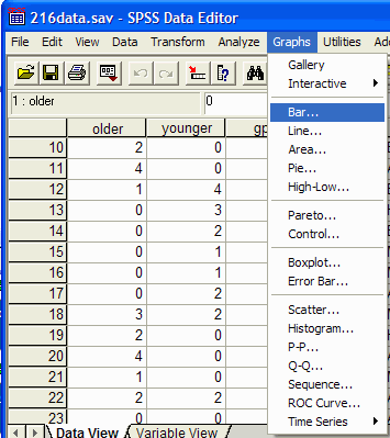
The Bar Charts dialog box appear:
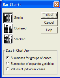
You can select from three types of bar graphs: simple,
clustered, and stacked. The simple bar graph has space between each bar on the graph. The
clustered bar graph does not put space between bars that are related, but does put space between
bars that are not related. This type of bar graph is useful when plotting the results of
studies with more than one IV. The stacked bar graph graphs related bars on top of each other.
This type of bar graph is often difficult to read correctly and probably should not be used in
most situations. Select the type of bar chart that you want by clicking on it. For now, click
on the simple bar chart, and click on the Define button. The Simple Bar chart dialog box
appears:
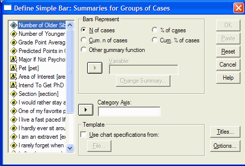
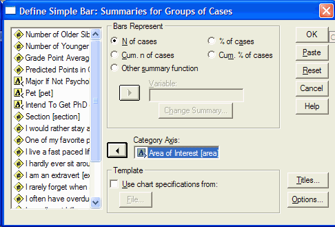
Select the variable that you want plotted on the category axis (the X axis) by clicking on
it and then move it into the Category Axis box by clicking on the arrow button to the left of
the Category Axis box. In this example, we will put the Area variable on the category axis:
If you are producing this graph for a journal, you will not put a title on the graph. If you
are preparing the graph for a presentation, then you should put a title on the graph. To title
the graph, click on the Titles button and the Titles dialog box will appear:
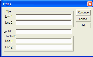
Enter your title(s) and click on the Continue button. From the Define Simple Bar dialog box,
click on OK to produce the bar graph. The SPSS output viewer will appear with the bar chart:
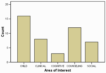
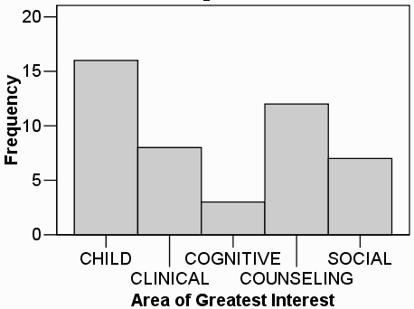
The height of each bar on this graph represents the number of people who responded that they liked the particular area of psychology the most. For example, 9 people reported that they liked Child psychology best.
The following techniques for editing the graph will work, with minor modifications, with any
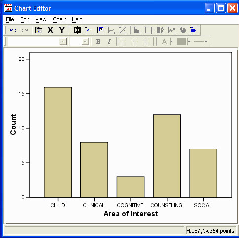
of the graphs that SPSS produces. To edit the graph, double click on the graph. When you
double click on the graph, the Chart Editor will open with the graph in it:
If you double click on part of the graph, a dialog box will appear that allows you to change
the properties of that part of the graph. In this example, we will be editing the bar graph
that was prepared above. If you double click on the category (X) axis title, the
Properties dialog box will appear:
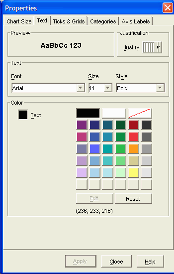
The Properties dialog box (if yours looks different, try clicking on the Text
tab) allows you to change the font, font size, font color, and justification of
the title by clicking on the appropriate parts of the dialog box. APA
style says that the text should be readable if the graph is reduced in size by
50%, so make sure that the text is sufficiently large. By clicking on the
Ticks & Grids tab, you can change which tick marks occur on the axis.
Click on Apply to make the changes, and Close to close the dialog box.
To change the axis title, click on the axis title, pause, and then click again. Type the new axis title. I have changed it from "Area of Interest in Psychology" to "Area of Greatest Interest". Press Enter to complete the change.
You can change the attributes of the scale (Y) axis by double clicking on it. The
Properties dialog box will appear:
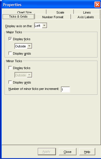
As with the category axis, you can change the Tick & Grids, and Chart Size by clicking on the appropriate tab in the dialog box. Additional tabs appear, such as Number Format and Scale which allow you to adjust the numbers used on the Y axis. Click on OK when you are done making changes. Click on Apply to make the changes, and Close to close the dialog box.
You can change the axis label in the same manner as the X axis label (click on the label, pause, click on the label again, type the new label, and press Enter). I've changed the label to Frequency.
You can change the spacing between the bars. This is useful when X axis is continuous rather
than categorical. To change the bar spacing double click on a bar to get the
Properties dialog box to appear:
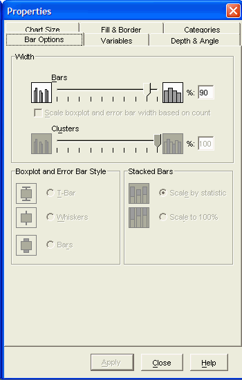
Make sure that the Bar Options tab is selected. Move the slider in the
Width, Bars section of the dialog box to make the bar wider (move it to the
right) or narrower (move it to the left.) Click on Apply to make the
change. Before you click on Close, click on the Fill & Border tab:
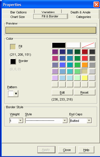
If you are preparing the graph for publication, select a color that is more
appropriate for an APA style paper (a shade of gray.) Click Apply and
Close.
When you are done making changes to the graph, close the Chart Editor by clicking on File | Close.
To reduce the amount of paper used in printing SPSS output, you can easily select which parts
of the output to print. The left panel of the SPSS Output Viewer determines which parts of the
SPSS output will be displayed and printed:

Each statistical test or chart that you request has an entry in the left panel of the output
viewer. In the above example, a single test or chart has been requested as indicated by the
single Graph entry in the left panel. You can hide all the output from the Graph command by
clicking the small box with a minus sign in it which is to the left of the Graph icon:
![]()
To display the hidden Graph output, click in the small box with a plus sign in it which is
to the left of the Graph icon:

There are three parts to the Graph output: Title, Notes, and Bar of count by area. Two of the three parts of the output are currently visible: Title and Bar. This is indicated by the open book icon to the left of the these two lines. The Notes are currently hidden as indicated by the closed book icon to the left of Notes. You can hide or make visible any part of the output by double clicking on the icon to the left.
If you want to print a single part of the output, simply select that part of the output by single clicking on it.
To print, click on File | Print (or the printer button
![]() in the button bar). The Print
dialog box will appear:
in the button bar). The Print
dialog box will appear:
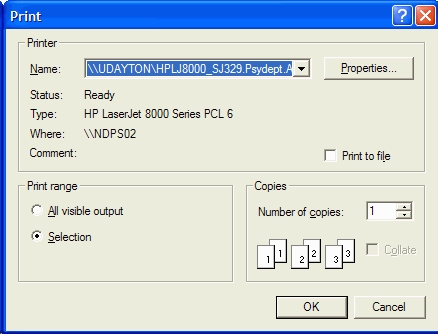
In the Print dialog box, select whether you want all the visible output printed or just the selected item. Click on OK. If you encounter printer problems, make sure that you have logged onto the network before printing.
Histograms show the frequency with which the various observations occur. To produce a
histogram, click on Graphs | Histogram. The Histograms dialog box will appear:
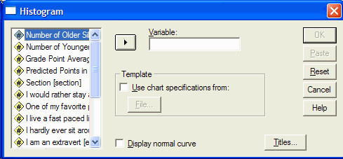
Select the variable in the left pane for which you want a histogram, and move that
variable into the Variables box by clicking on the arrow button to the left of the Variable
box. In this case, I have selected the Older variable:
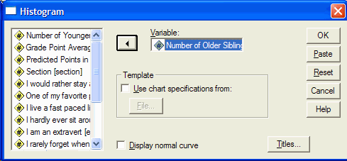
For a standard histogram, make sure that the Display Normal Curve option is not
checked. Click on the OK button. The histogram will appear in the SPSS Output Viewer:
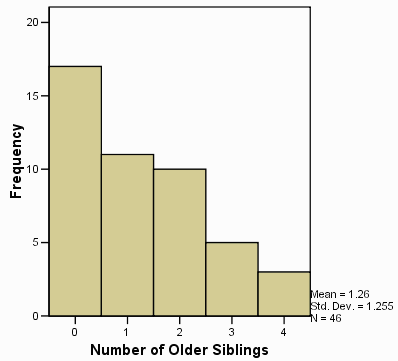
You can edit the histogram using the editing techniques discussed earlier.
Line graphs are often used in the same ways as bar graphs, except that bar graphs are
appropriate for discrete variables and line graphs are appropriate for continuous variables.
To produce a line graph, click on Graphs | Line and the line graph dialog box will appear:
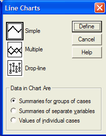
There are three types of line charts that you can produce. The Simple line chart consists
of a single line. It is useful for describing the results of experiments that have a single
IV, or describing a single variable. The Multiple line chart has multiple lines. It is
useful for describing the results of experiments with two (or three) independent variables,
or for describing multiple variables (all of which are measured on the same scale.) The drop-
line chart is a variation on the multiple line chart. I have never seen a drop-line chart in print.
Select the desired type of line chart by clicking on its icon and then clicking on the
Define button. In this case, I will select the simple line chart:

The Define Simple Line dialog box appears. In the left hand pane, click on the variable
that you want plotted on the category (X) axis, and move it into the Category Axis text box
by clicking on the arrow button to the left of the Category Axis text box. In this example,
I have selected GPA as the variable to go on the category axis:
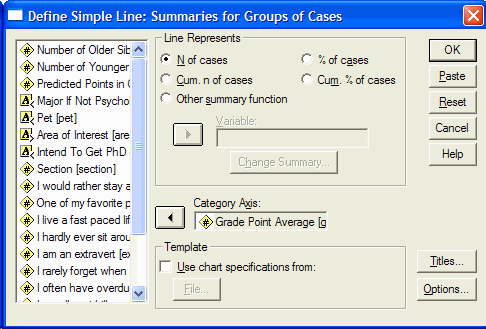
Click on OK to produce the graph:
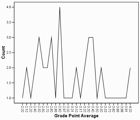
This graph can be edited using the techniques discussed above. It represents the number of observations in each of the several classes of GPA scores.
You can create Tukey box plots by clicking on Analyze | Descriptive Statistics | Explore. The Explore dialog box will appear:
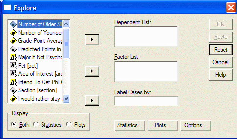
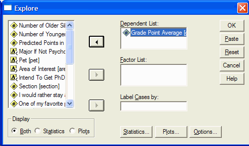
Click on the variable in the left panel for which you want a box plot and move it into the
Dependent List by clicking on the arrow button to the left of the Dependent List box. In this
example, I have selected GPA as the variable to prodcue a box plot:
Click on the Plots button at the bottom of the Explore dialog box. The Explore Plots dialog box appears:
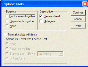
Make sure that the Factors levels together option is checked in the Boxplots section of the
dialog box. Click on Continue. From the Explore dialog box, click on the OK button. The
boxplot will appear in the SPSS output viewer:
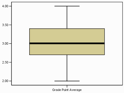
As in all box plots, the top of the box represents the 75th percentile, the bottom of the box represents the 25th percentile, and the line in the middle represents the 50th percentile. The whiskers (the lines that extend out the top and bottom of the box) represent the highest and lowest values that are not outliers or extreme values. Outliers (values that are between 1.5 and 3 times the interquartile range) and extreme values (values that are more than 3 times the interquartile range) are represented by circles beyond the whiskers.
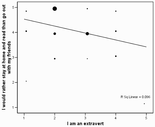
Scatter plots are useful for showing relations between two variables. They are a vital first step in performing correlation and regression. For each observation scatter plots show the value of one of the variables on the X axis and the value of the other variable on the Y axis.
To produce a scatter plot, click on Graphs | Scatter. The Scatter Plot dialog box appears:
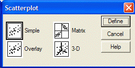
There are several types of scatter plots that you can prepared. The Simple scatter plot
allows you to plot one variable as a function of another. It the most frequently used type
of scatter plot for simple correlation and linear regression. The Matrix scatter plot allows
you to plot several simple scatter plots organized in a matrix. This is useful when you
want to show all possible scatter plots for a combination of variabiles. The Overlay scatter plot allows
you to plot several variables as a function of another single variable. The 3D scatter plot
allows you to three dimensional (i.e. 3 variable) scatter plots. Select the type of scatter
plot that you want by clicking on appropriate icon (in this example Simple) and click on the
Define button. The Simple Scatter Plot dialog box appears:
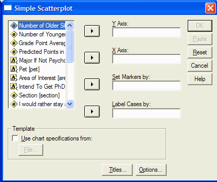
In the left panel, click on the variable that you want plotted on the Y axis, and move it
into the Y axis box by clicking on the arrow button to the left of the Y axis box. In the
left panel, click on the variable that you want plotted on the X axis, and move it into the X
axis boxy by clicking on the arrow button to the left of the X axis box. In this example, I
have decided to plot the Friends variable on the Y axis and the Extravert variable on the
X axis:
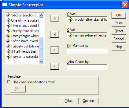
Click on the OK button in the Simple Scatter Plot dialog box. The scatter plot will appear
in the SPSS Output Viewer:
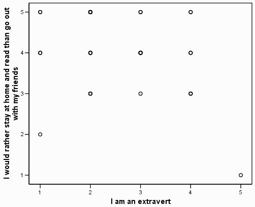
We should add a regression line and indicate the point density. Double clicked on the graph in the SPSS output viewer to open the Chart Editor.
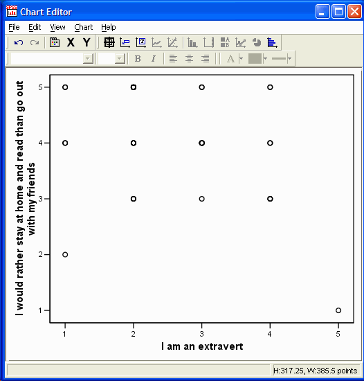
Click on one of the data points. The data points will be highlighted:
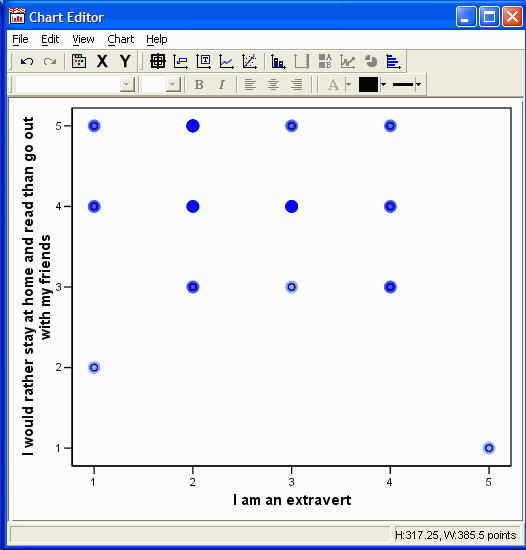
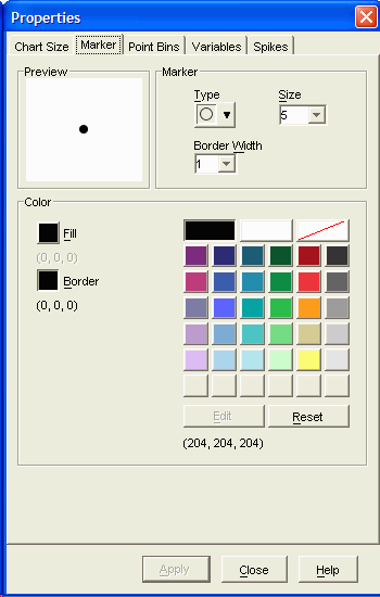
Either click on the properties button
![]() , click on Edit |
Properties, or press Ctrl-t to open the properties dialog box:
, click on Edit |
Properties, or press Ctrl-t to open the properties dialog box:
Click on the Point Bins tab:
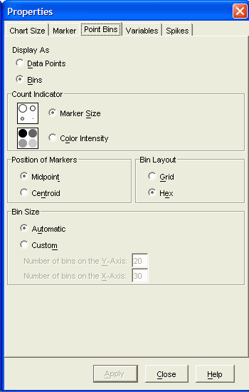
In the Display As section, click on Bins, Apply, and Close.
While the data is still selected, add a regression line by clicking on either the Add
Fit Line button ![]() or by clicking
on Chart | Add Chart Element | Fit Line at Total. The following Properties
dialog box appears:
or by clicking
on Chart | Add Chart Element | Fit Line at Total. The following Properties
dialog box appears:
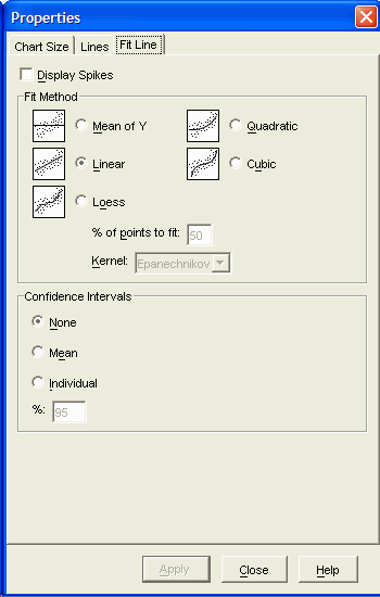
Click on the Fit Line tab if it is not already selected. In the Fit Method section, select Linear. Click on Apply (if necessary) and then Close.
Close the chart editor by clicking File | Close, or by clicking on the X in the upper left corner of the window or Alt-F4.
